final case class Card(header: Option[CardHeader] = _root_.scala.None, sections: Seq[Section] = _root_.scala.Seq.empty, sectionDividerStyle: DividerStyle = com.google.apps.card.v1.card.Card.DividerStyle.DIVIDER_STYLE_UNSPECIFIED, cardActions: Seq[CardAction] = _root_.scala.Seq.empty, name: String = "", fixedFooter: Option[CardFixedFooter] = _root_.scala.None, displayStyle: DisplayStyle = com.google.apps.card.v1.card.Card.DisplayStyle.DISPLAY_STYLE_UNSPECIFIED, peekCardHeader: Option[CardHeader] = _root_.scala.None, unknownFields: UnknownFieldSet = _root_.scalapb.UnknownFieldSet.empty) extends GeneratedMessage with Updatable[Card] with Product with Serializable
A card interface displayed in a Google Chat message or Google Workspace Add-on.
Cards support a defined layout, interactive UI elements like buttons, and rich media like images. Use cards to present detailed information, gather information from users, and guide users to take a next step.
[Card builder](https://addons.gsuite.google.com/uikit/builder)
To learn how to build cards, see the following documentation:
* For Google Chat apps, see [Design the components of a card or dialog](https://developers.google.com/workspace/chat/design-components-card-dialog). * For Google Workspace Add-ons, see [Card-based interfaces](https://developers.google.com/apps-script/add-ons/concepts/cards).
**Example: Card message for a Google Chat app**
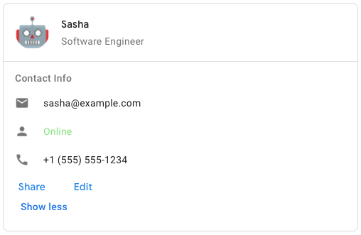
To create the sample card message in Google Chat, use the following JSON:
{
  "cardsV2": [
    {
      "cardId": "unique-card-id",
      "card": {
        "header": {
           "title": "Sasha",
           "subtitle": "Software Engineer",
           "imageUrl":
           "https://developers.google.com/workspace/chat/images/quickstart-app-avatar.png",
           "imageType": "CIRCLE",
           "imageAltText": "Avatar for Sasha"
         },
         "sections": [
           {
             "header": "Contact Info",
             "collapsible": true,
             "uncollapsibleWidgetsCount": 1,
             "widgets": [
               {
                 "decoratedText": {
                   "startIcon": {
                     "knownIcon": "EMAIL"
                   },
                   "text": "sasha@example.com"
                 }
               },
               {
                 "decoratedText": {
                   "startIcon": {
                     "knownIcon": "PERSON"
                   },
                   "text": "<font color=&92;"#80e27e&92;">Online</font>"
                 }
               },
               {
                 "decoratedText": {
                   "startIcon": {
                     "knownIcon": "PHONE"
                   },
                   "text": "+1 (555) 555-1234"
                 }
               },
               {
                 "buttonList": {
                   "buttons": [
                     {
                       "text": "Share",
                       "onClick": {
                        "openLink": {
                           "url": "https://example.com/share"
                         }
                       }
                     },
                     {
                       "text": "Edit",
                       "onClick": {
                         "action": {
                           "function": "goToView",
                           "parameters": [
                             {
                               "key": "viewType",
                               "value": "EDIT"
                             }
                           ]
                         }
                       }
                     }
                   ]
                 }
               }
             ]
           }
         ]
       }
    }
  ]
}
- header
The header of the card. A header usually contains a leading image and a title. Headers always appear at the top of a card.
- sections
Contains a collection of widgets. Each section has its own, optional header. Sections are visually separated by a line divider. For an example in Google Chat apps, see [Define a section of a card](https://developers.google.com/workspace/chat/design-components-card-dialog#define_a_section_of_a_card).
- sectionDividerStyle
The divider style between sections.
- cardActions
The card's actions. Actions are added to the card's toolbar menu. [Google Workspace Add-ons](https://developers.google.com/workspace/add-ons): For example, the following JSON constructs a card action menu with
SettingsandSend Feedbackoptions:"card_actions": [ { "actionLabel": "Settings", "onClick": { "action": { "functionName": "goToView", "parameters": [ { "key": "viewType", "value": "SETTING" } ], "loadIndicator": "LoadIndicator.SPINNER" } } }, { "actionLabel": "Send Feedback", "onClick": { "openLink": { "url": "https://example.com/feedback" } } } ]- name
Name of the card. Used as a card identifier in card navigation. [Google Workspace Add-ons](https://developers.google.com/workspace/add-ons):
- fixedFooter
The fixed footer shown at the bottom of this card. Setting
fixedFooterwithout specifying aprimaryButtonor asecondaryButtoncauses an error. For Chat apps, you can use fixed footers in [dialogs](https://developers.google.com/workspace/chat/dialogs), but not [card messages](https://developers.google.com/workspace/chat/create-messages#create). [Google Workspace Add-ons and Chat apps](https://developers.google.com/workspace/extend):- displayStyle
In Google Workspace Add-ons, sets the display properties of the
peekCardHeader. [Google Workspace Add-ons](https://developers.google.com/workspace/add-ons):- peekCardHeader
When displaying contextual content, the peek card header acts as a placeholder so that the user can navigate forward between the homepage cards and the contextual cards. [Google Workspace Add-ons](https://developers.google.com/workspace/add-ons):
- Annotations
- @SerialVersionUID()
- Source
- Card.scala
- Alphabetic
- By Inheritance
- Card
- Updatable
- GeneratedMessage
- Serializable
- Product
- Equals
- AnyRef
- Any
- Hide All
- Show All
- Public
- Protected
Instance Constructors
- new Card(header: Option[CardHeader] = _root_.scala.None, sections: Seq[Section] = _root_.scala.Seq.empty, sectionDividerStyle: DividerStyle = com.google.apps.card.v1.card.Card.DividerStyle.DIVIDER_STYLE_UNSPECIFIED, cardActions: Seq[CardAction] = _root_.scala.Seq.empty, name: String = "", fixedFooter: Option[CardFixedFooter] = _root_.scala.None, displayStyle: DisplayStyle = com.google.apps.card.v1.card.Card.DisplayStyle.DISPLAY_STYLE_UNSPECIFIED, peekCardHeader: Option[CardHeader] = _root_.scala.None, unknownFields: UnknownFieldSet = _root_.scalapb.UnknownFieldSet.empty)
- header
The header of the card. A header usually contains a leading image and a title. Headers always appear at the top of a card.
- sections
Contains a collection of widgets. Each section has its own, optional header. Sections are visually separated by a line divider. For an example in Google Chat apps, see [Define a section of a card](https://developers.google.com/workspace/chat/design-components-card-dialog#define_a_section_of_a_card).
- sectionDividerStyle
The divider style between sections.
- cardActions
The card's actions. Actions are added to the card's toolbar menu. [Google Workspace Add-ons](https://developers.google.com/workspace/add-ons): For example, the following JSON constructs a card action menu with
SettingsandSend Feedbackoptions:"card_actions": [ { "actionLabel": "Settings", "onClick": { "action": { "functionName": "goToView", "parameters": [ { "key": "viewType", "value": "SETTING" } ], "loadIndicator": "LoadIndicator.SPINNER" } } }, { "actionLabel": "Send Feedback", "onClick": { "openLink": { "url": "https://example.com/feedback" } } } ]- name
Name of the card. Used as a card identifier in card navigation. [Google Workspace Add-ons](https://developers.google.com/workspace/add-ons):
- fixedFooter
The fixed footer shown at the bottom of this card. Setting
fixedFooterwithout specifying aprimaryButtonor asecondaryButtoncauses an error. For Chat apps, you can use fixed footers in [dialogs](https://developers.google.com/workspace/chat/dialogs), but not [card messages](https://developers.google.com/workspace/chat/create-messages#create). [Google Workspace Add-ons and Chat apps](https://developers.google.com/workspace/extend):- displayStyle
In Google Workspace Add-ons, sets the display properties of the
peekCardHeader. [Google Workspace Add-ons](https://developers.google.com/workspace/add-ons):- peekCardHeader
When displaying contextual content, the peek card header acts as a placeholder so that the user can navigate forward between the homepage cards and the contextual cards. [Google Workspace Add-ons](https://developers.google.com/workspace/add-ons):
Value Members
- final def !=(arg0: Any): Boolean
- Definition Classes
- AnyRef → Any
- final def ##: Int
- Definition Classes
- AnyRef → Any
- final def ==(arg0: Any): Boolean
- Definition Classes
- AnyRef → Any
- def addAllCardActions(__vs: Iterable[CardAction]): Card
- def addAllSections(__vs: Iterable[Section]): Card
- def addCardActions(__vs: CardAction*): Card
- def addSections(__vs: Section*): Card
- final def asInstanceOf[T0]: T0
- Definition Classes
- Any
- val cardActions: Seq[CardAction]
- def clearCardActions: Card
- def clearFixedFooter: Card
- def clearHeader: Card
- def clearPeekCardHeader: Card
- def clearSections: Card
- def clone(): AnyRef
- Attributes
- protected[lang]
- Definition Classes
- AnyRef
- Annotations
- @throws(classOf[java.lang.CloneNotSupportedException]) @HotSpotIntrinsicCandidate() @native()
- def companion: Card.type
- Definition Classes
- Card → GeneratedMessage
- def discardUnknownFields: Card
- val displayStyle: DisplayStyle
- final def eq(arg0: AnyRef): Boolean
- Definition Classes
- AnyRef
- val fixedFooter: Option[CardFixedFooter]
- final def getClass(): Class[_ <: AnyRef]
- Definition Classes
- AnyRef → Any
- Annotations
- @HotSpotIntrinsicCandidate() @native()
- def getField(__field: FieldDescriptor): PValue
- Definition Classes
- Card → GeneratedMessage
- def getFieldByNumber(__fieldNumber: Int): Any
- Definition Classes
- Card → GeneratedMessage
- def getFixedFooter: CardFixedFooter
- def getHeader: CardHeader
- def getPeekCardHeader: CardHeader
- val header: Option[CardHeader]
- final def isInstanceOf[T0]: Boolean
- Definition Classes
- Any
- val name: String
- final def ne(arg0: AnyRef): Boolean
- Definition Classes
- AnyRef
- final def notify(): Unit
- Definition Classes
- AnyRef
- Annotations
- @HotSpotIntrinsicCandidate() @native()
- final def notifyAll(): Unit
- Definition Classes
- AnyRef
- Annotations
- @HotSpotIntrinsicCandidate() @native()
- val peekCardHeader: Option[CardHeader]
- def productElementNames: Iterator[String]
- Definition Classes
- Product
- val sectionDividerStyle: DividerStyle
- val sections: Seq[Section]
- def serializedSize: Int
- Definition Classes
- Card → GeneratedMessage
- final def synchronized[T0](arg0: => T0): T0
- Definition Classes
- AnyRef
- final def toByteArray: Array[Byte]
- Definition Classes
- GeneratedMessage
- final def toByteString: ByteString
- Definition Classes
- GeneratedMessage
- final def toPMessage: PMessage
- Definition Classes
- GeneratedMessage
- def toProtoString: String
- Definition Classes
- Card → GeneratedMessage
- val unknownFields: UnknownFieldSet
- def update(ms: (Lens[Card, Card]) => Mutation[Card]*): Card
- Definition Classes
- Updatable
- final def wait(arg0: Long, arg1: Int): Unit
- Definition Classes
- AnyRef
- Annotations
- @throws(classOf[java.lang.InterruptedException])
- final def wait(arg0: Long): Unit
- Definition Classes
- AnyRef
- Annotations
- @throws(classOf[java.lang.InterruptedException]) @native()
- final def wait(): Unit
- Definition Classes
- AnyRef
- Annotations
- @throws(classOf[java.lang.InterruptedException])
- def withCardActions(__v: Seq[CardAction]): Card
- def withDisplayStyle(__v: DisplayStyle): Card
- def withFixedFooter(__v: CardFixedFooter): Card
- def withHeader(__v: CardHeader): Card
- def withName(__v: String): Card
- def withPeekCardHeader(__v: CardHeader): Card
- def withSectionDividerStyle(__v: DividerStyle): Card
- def withSections(__v: Seq[Section]): Card
- def withUnknownFields(__v: UnknownFieldSet): Card
- final def writeDelimitedTo(output: OutputStream): Unit
- Definition Classes
- GeneratedMessage
- def writeTo(_output__: CodedOutputStream): Unit
- Definition Classes
- Card → GeneratedMessage
- final def writeTo(output: OutputStream): Unit
- Definition Classes
- GeneratedMessage